Valmano Landing Page
UI/UX Design / VALMANO GmbH / 2016
In the era of scanning and skimming through content, it’s vital to catch the eye of the potential customer. Even if you have a good product or service and an excellent copy, without proper presentation, it risks being passed by a potential customer.
At Valmano, we were constantly looking for UI/UX best practices to enhance the customer experience. As a result, we have introduced numerous improvements to the Valmano website, such as visualising product categories with icons, optimising the checkout page, developing and implementing new functionalities (personalised digital gift cards, mouse hover state, wishlist, etc.) and curated product microsites.
Icons
The icons have been implemented on the landing page to make our offer visually outstanding. The structured information became easier to read and memorise, making its visual representation more eye-catching.
Icons
The icons have been implemented on the landing page to make our offer visually outstanding. The structured information became easier to read and memorise, making its visual representation more eye-catching.


Personalised digital gift cards
Gift cards are one of the best ways to boost revenue, build meaningful relationships with customers, increase traffic, and grow business.
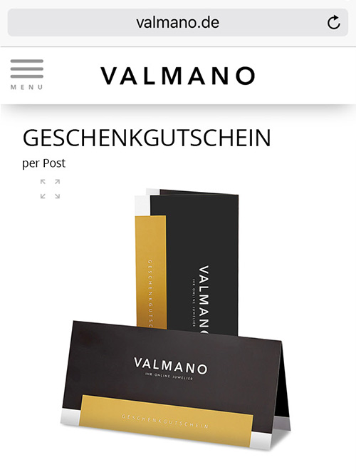
In addition to the existing paper gift cards, we added an e-gift version, which the customer can personalise by adding a short message and indicating the recipient’s name.
The card acts like a physical product that needs to be added to the basket and purchased.


Mouse hover state
The primary purpose of the Product List is for users to easily and accurately determine which products to investigate further. When information is lacking, inconsistent, or inadequate, the users will experience many usability issues, which can ultimately lead to site abandonment.
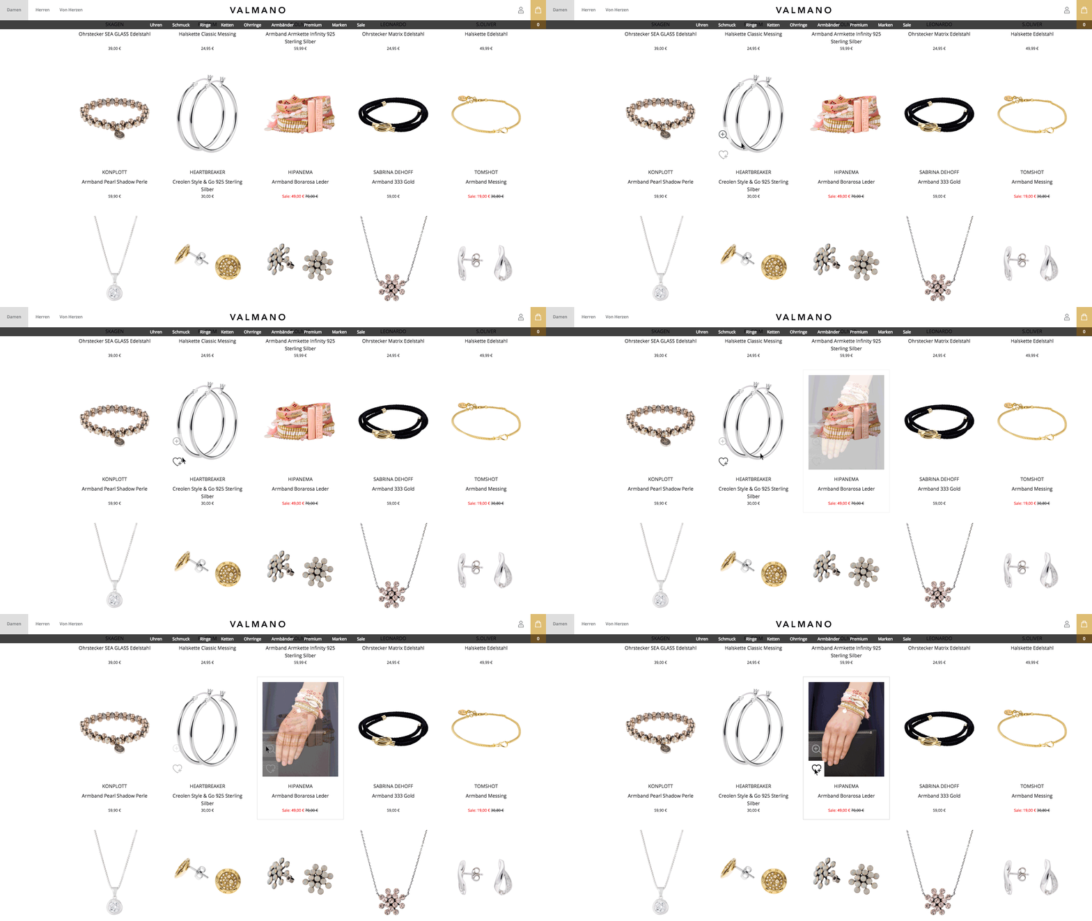
At Valmano, we actively mitigated these issues by utilising the mouse hover state to display additional information, e.g. colour swatches or images — right within the list item, when the user moves their cursor over it.
We consistently observed that displaying additional list item information on mouse hover leads to less time spent on irrelevant products, and more time spent with relevant ones — resulting in an overall higher conversion rate.

Wishlist
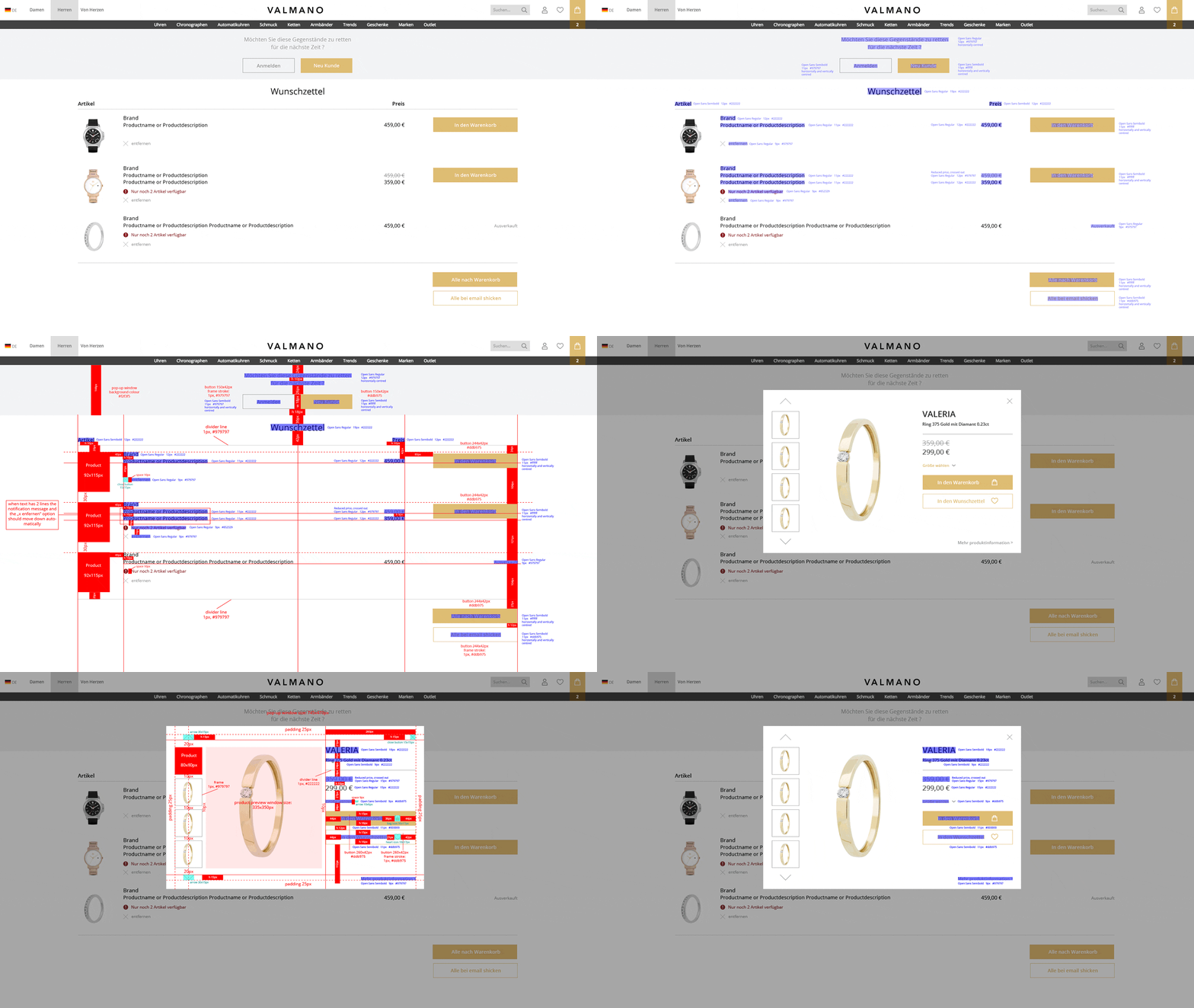
The average cart abandonment rate across all industries is 69.57 percent. This makes it something e-commerce brands need to take seriously and look for creative ways to reduce the number.
One of the more underrated but highly effective techniques is to offer buyers an e-commerce wishlist.
A wishlist allows shoppers to create personalised collections of products they want to buy and save them in their user account for future reference. Wishlists signify a customer’s interest in a product without an immediate intent to purchase.
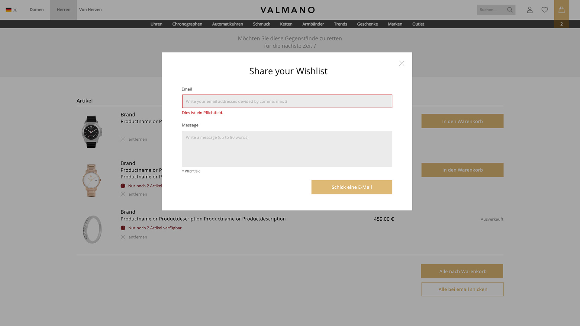
In addition, we designed a functionality that allows the client to share their wish list with friends.


Microsite “Wedding World”
Microsites hyper-focus on specific content for a specific audience. Therefore, they are a cost-effective and flexible opportunity for the business to make the most of targeted content.
At Valmano, we created “Wedding World” (“Hochzeit Welt”), a special microsite with carefully selected jewellery for weddings. It contained numerous categories, such as “for the groom”, “for the bride”, “for the groomsmen”, for the bridesmaids” and more.


